Three column
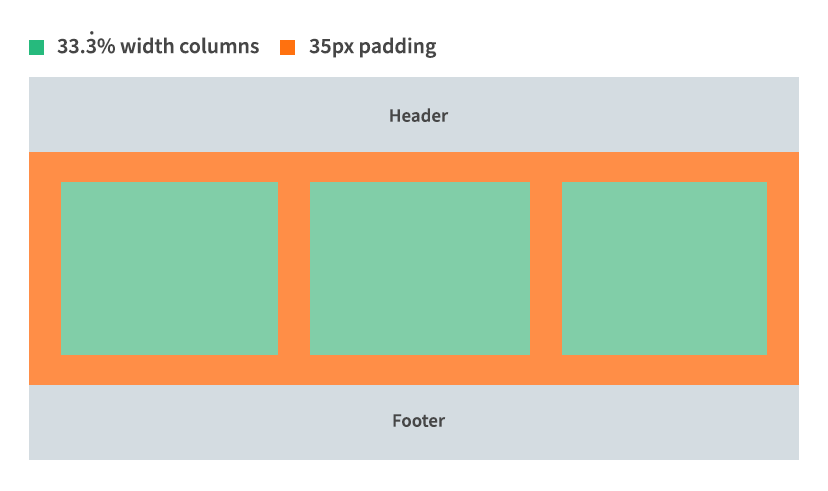
Widescreen (above 768px)
The three column grid is used to create page layout (sidebars) or for presenting content within custom page designs.
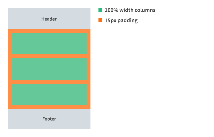
Mobile (below 768px)
Layout grids
The three column grid is used to create page layout (sidebars) or for presenting content within custom page designs.