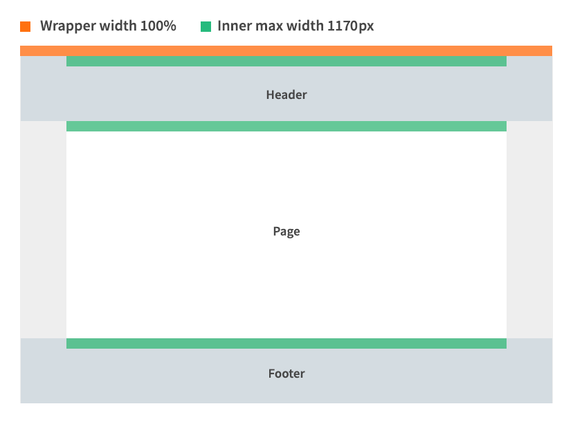
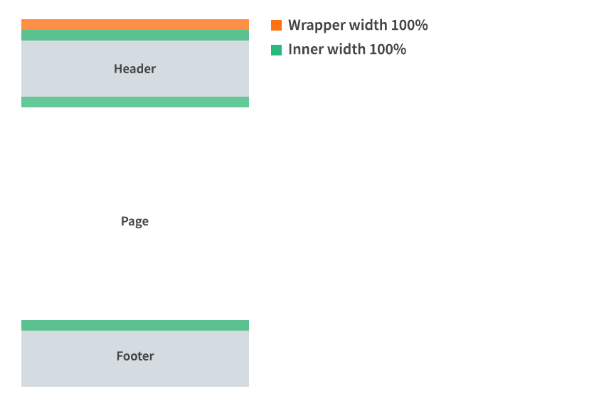
Site and page width
Widescreen (above 768px)
While the website uses a full width header and footer design, all elements within are limited to a maximum width of 1170px. This creates a centred page effect on higher resolution screens.
Mobile (below 768px)
Page width becomes 100% hiding body background colour.